Over the years, Harvey Nichols has expanded its global presence significantly. Initially launching dedicated websites for Hong Kong and the Rest of the World, they have now begun franchising the brand in the Middle East, with Arabic versions of the websites set to launch soon.
However, as different teams worked on their respective websites, inconsistencies started to emerge. Maintaining consistency across all customer-facing touch points is crucial for any brand, especially one like Harvey Nichols, whose customers are international, loyal, and engage both in-store and online. A seamless global digital user experience is essential for such a luxury retailer.
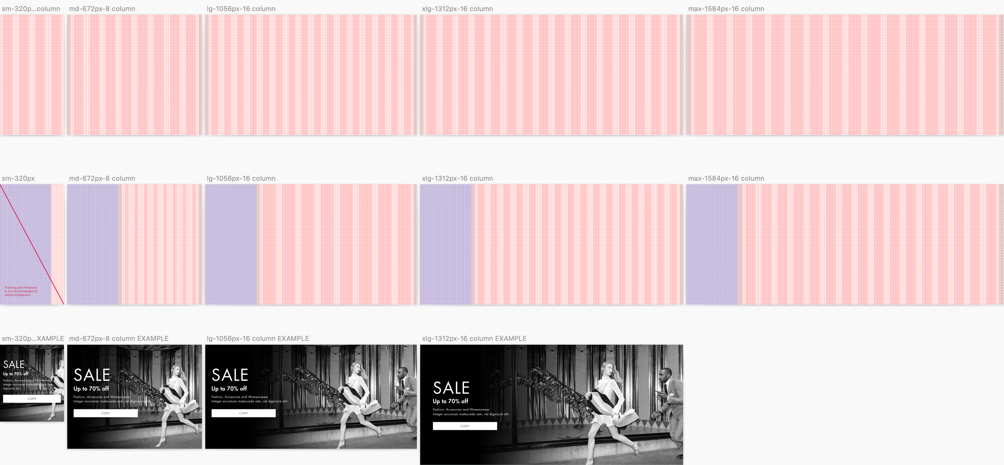
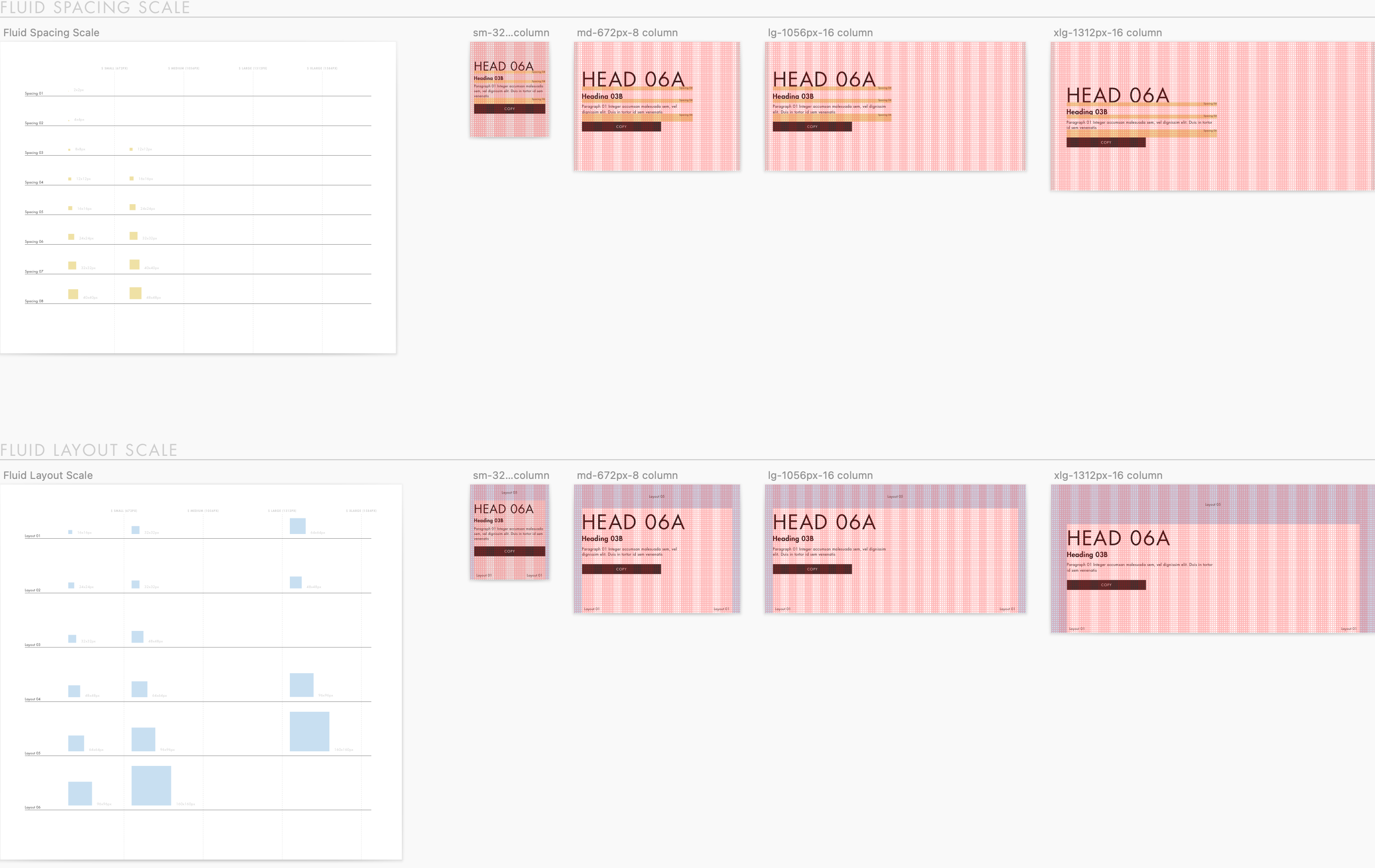
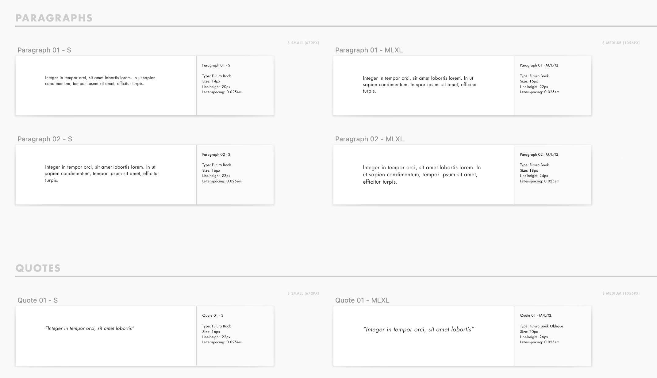
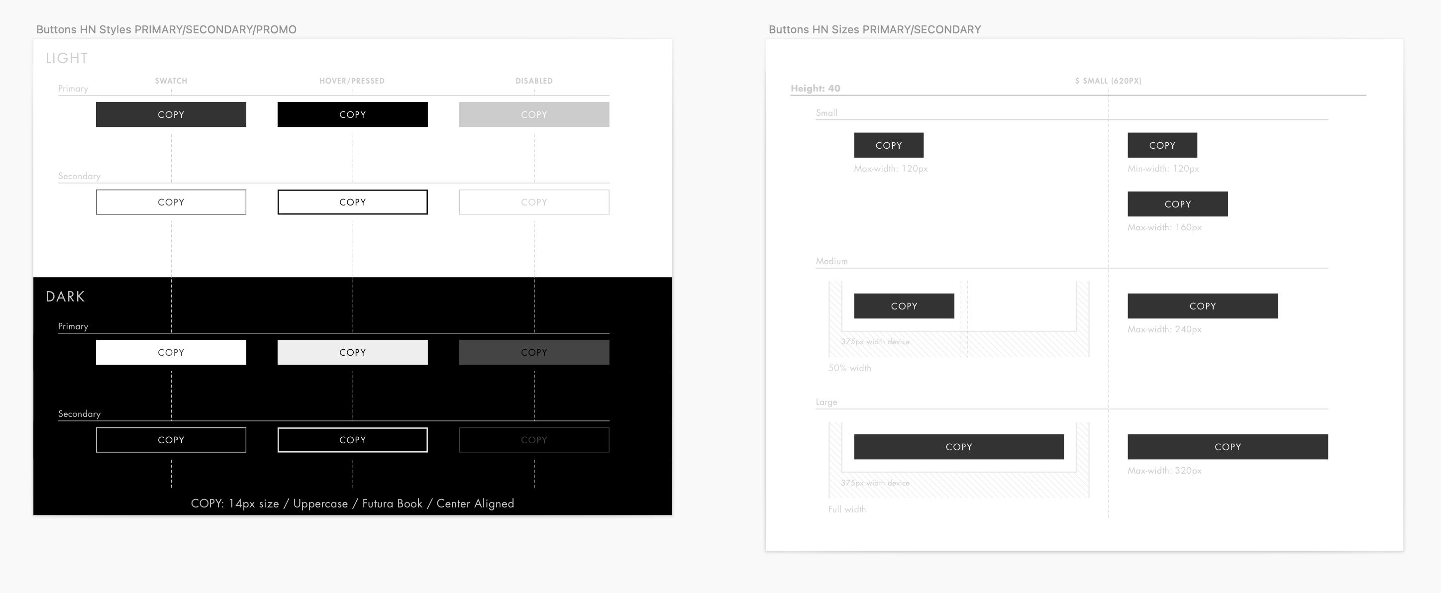
To address this, we began developing a pattern library. Drawing inspiration from three main references—IBM's Carbon Design System, Google's Material Design, and Apple's Human Interface Guidelines—I took the lead in establishing rules and frameworks for our project.
While the project remains ongoing and continually evolving to incorporate new trends, enhance website functionality, and optimise customer journeys, this presentation will focus on laying out the foundational aspects and delving into specific details of our approach.
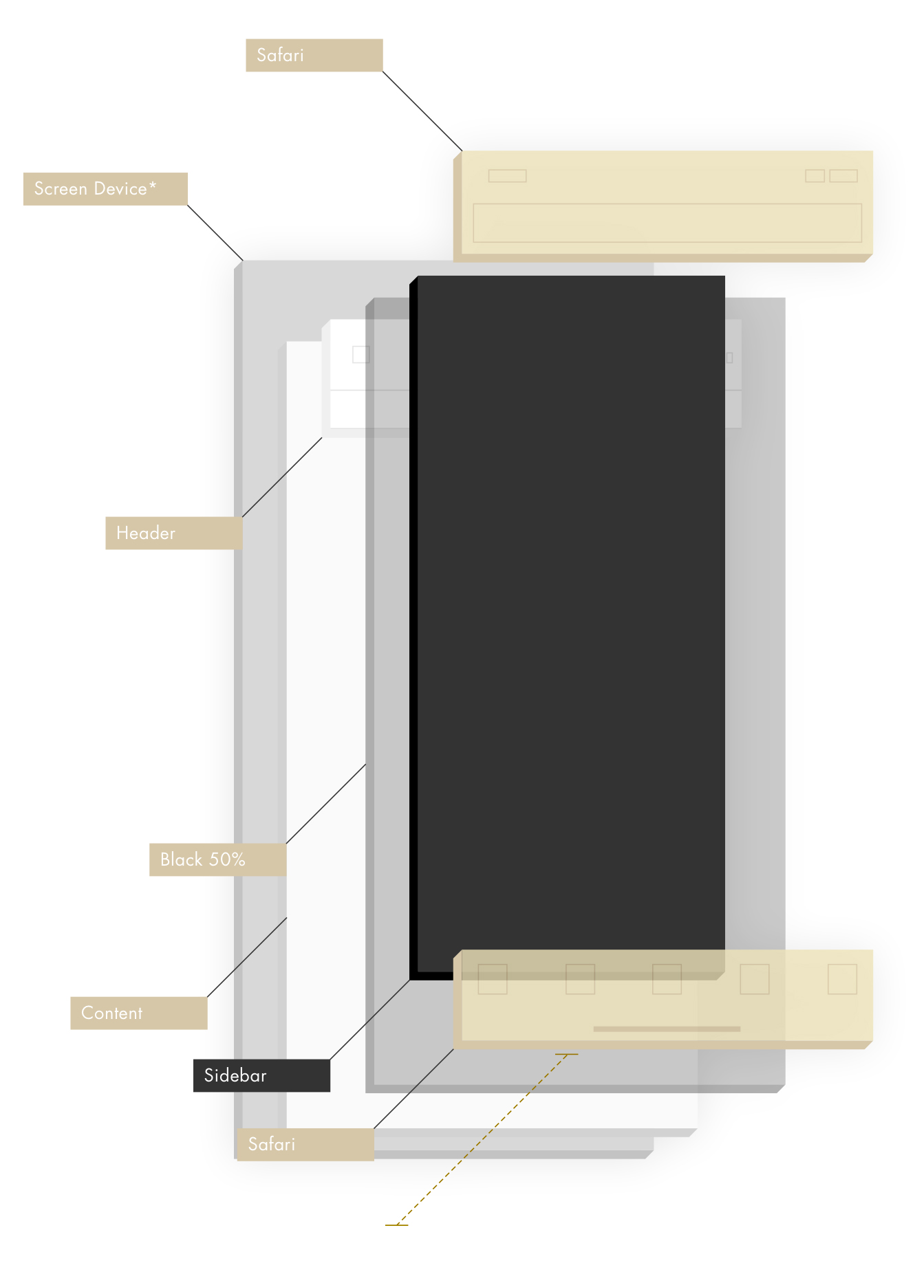
Click on each of the following elements to navigate through the entire project.
However, as different teams worked on their respective websites, inconsistencies started to emerge. Maintaining consistency across all customer-facing touch points is crucial for any brand, especially one like Harvey Nichols, whose customers are international, loyal, and engage both in-store and online. A seamless global digital user experience is essential for such a luxury retailer.
To address this, we began developing a pattern library. Drawing inspiration from three main references—IBM's Carbon Design System, Google's Material Design, and Apple's Human Interface Guidelines—I took the lead in establishing rules and frameworks for our project.
While the project remains ongoing and continually evolving to incorporate new trends, enhance website functionality, and optimise customer journeys, this presentation will focus on laying out the foundational aspects and delving into specific details of our approach.
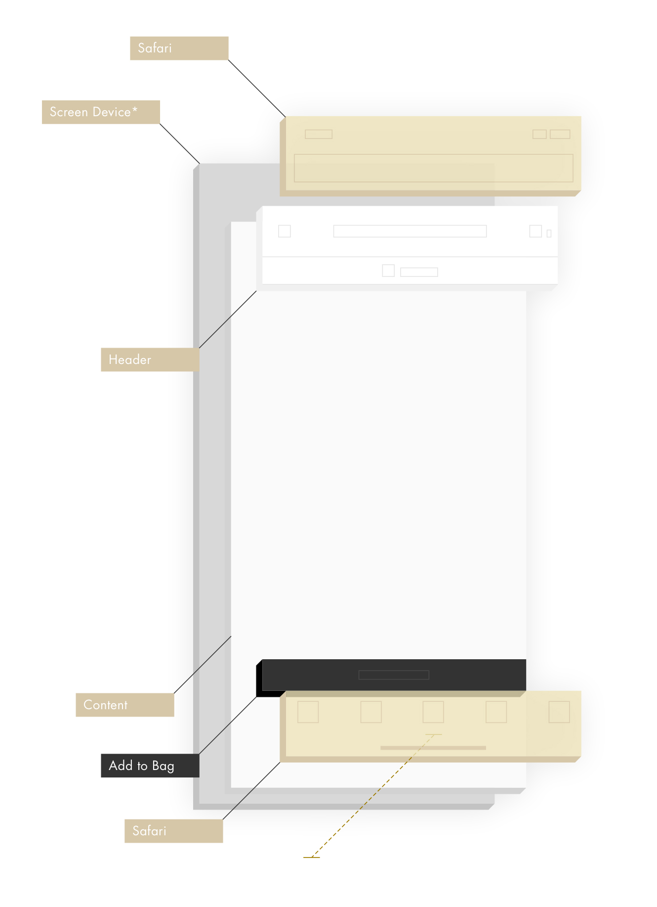
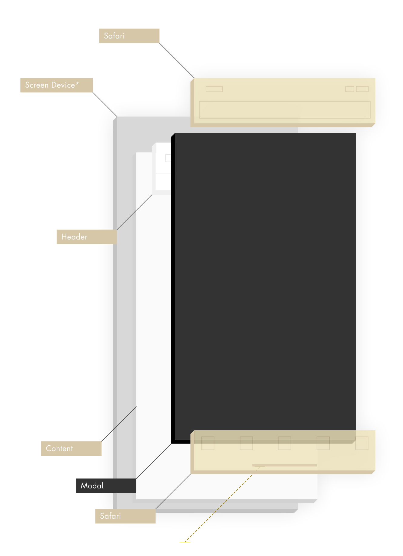
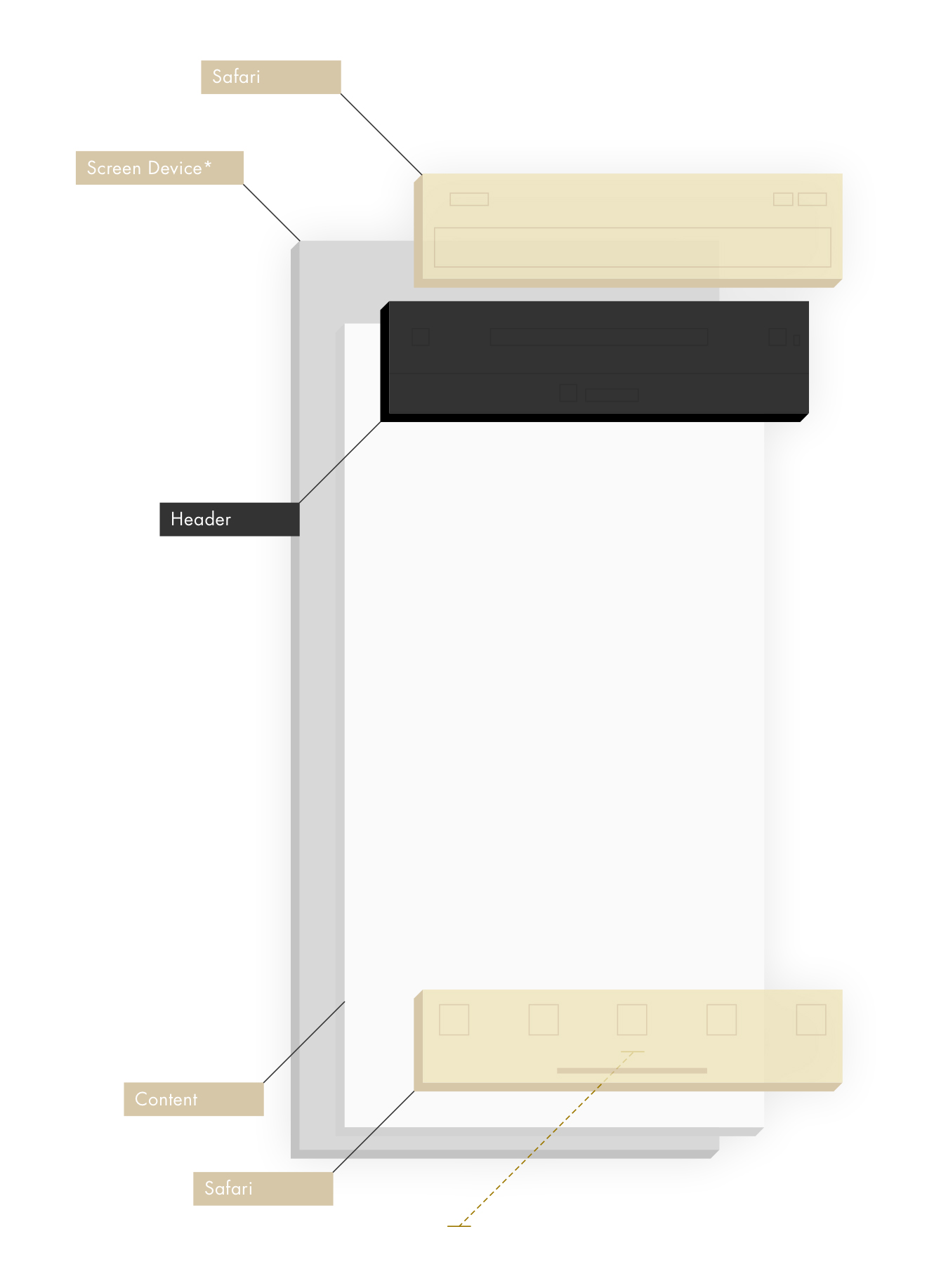
Click on each of the following elements to navigate through the entire project.


