Harvey Nichols - APP (iOS/Android)

Project introduction

Before this initiative, Harvey Nichols did not have a transactional native app. To kickstart the project, a third-party company provided a basic native app template. As the Senior Product Designer, I led the project through various stages to ensure the final product was perfectly aligned with the Harvey Nichols brand and delivered a satisfactory user experience.

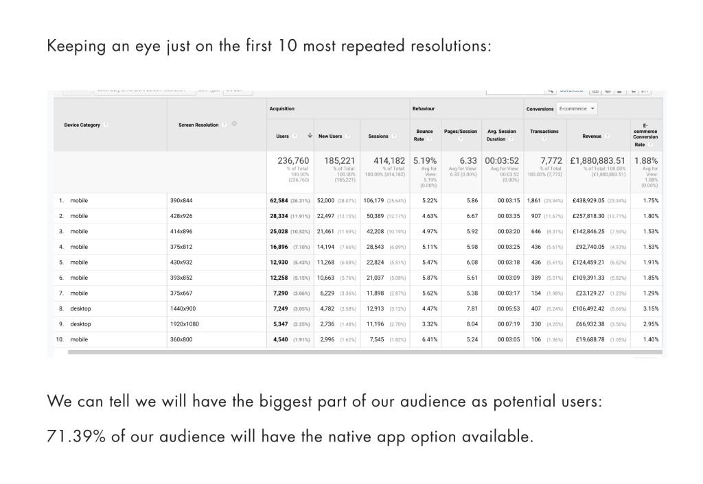
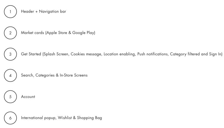
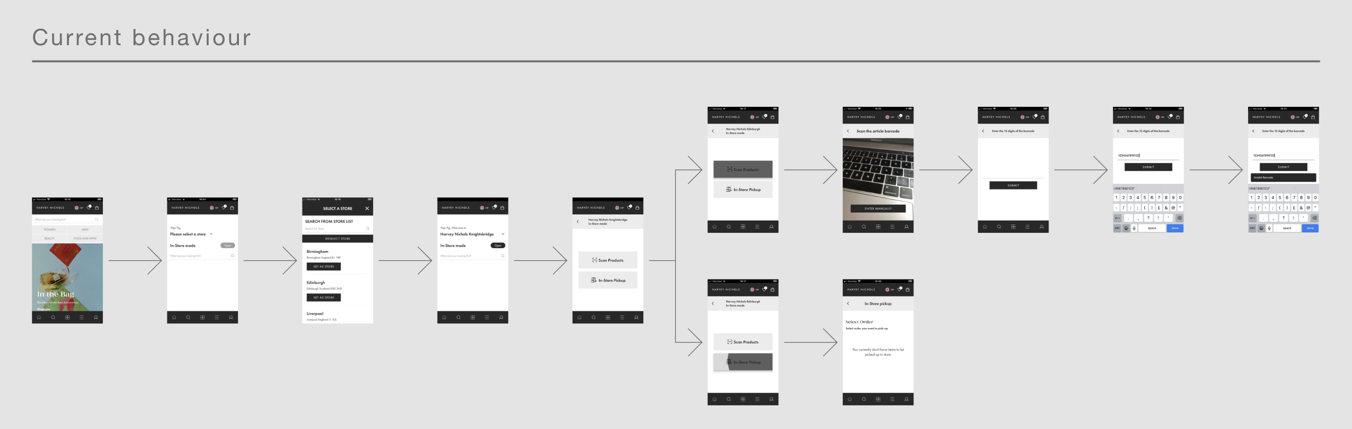
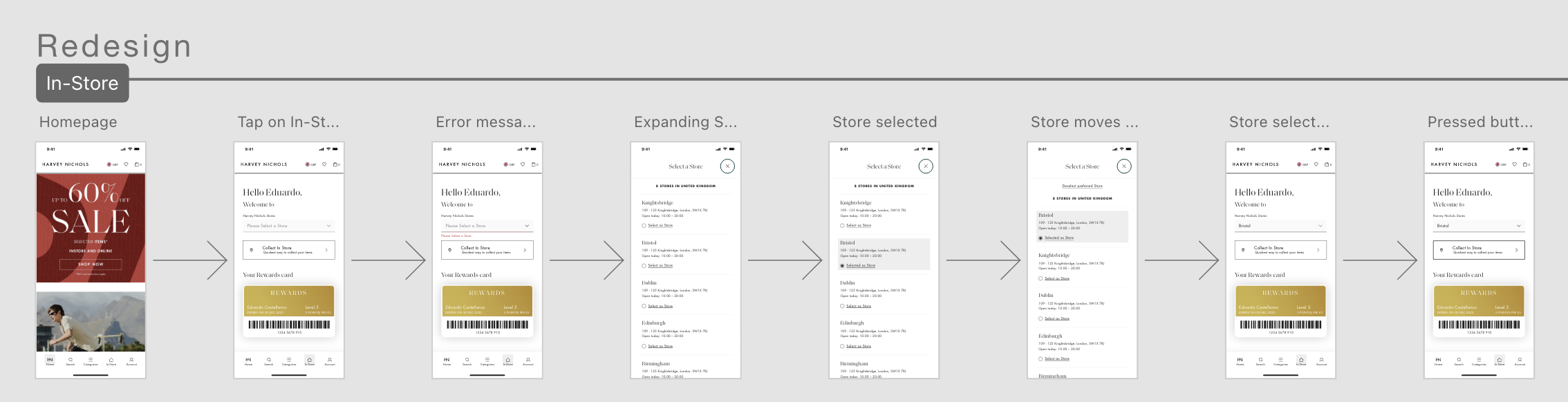
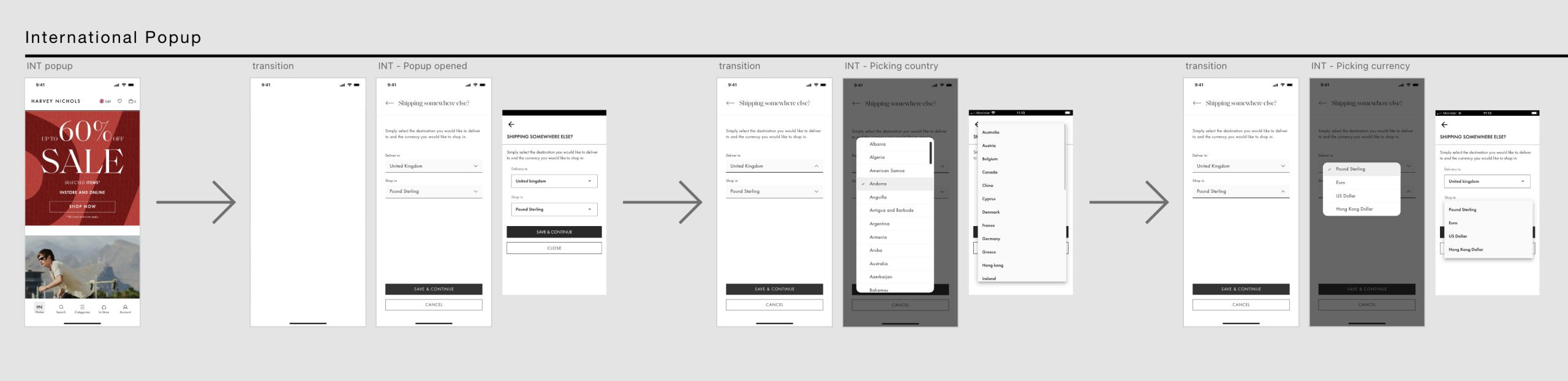
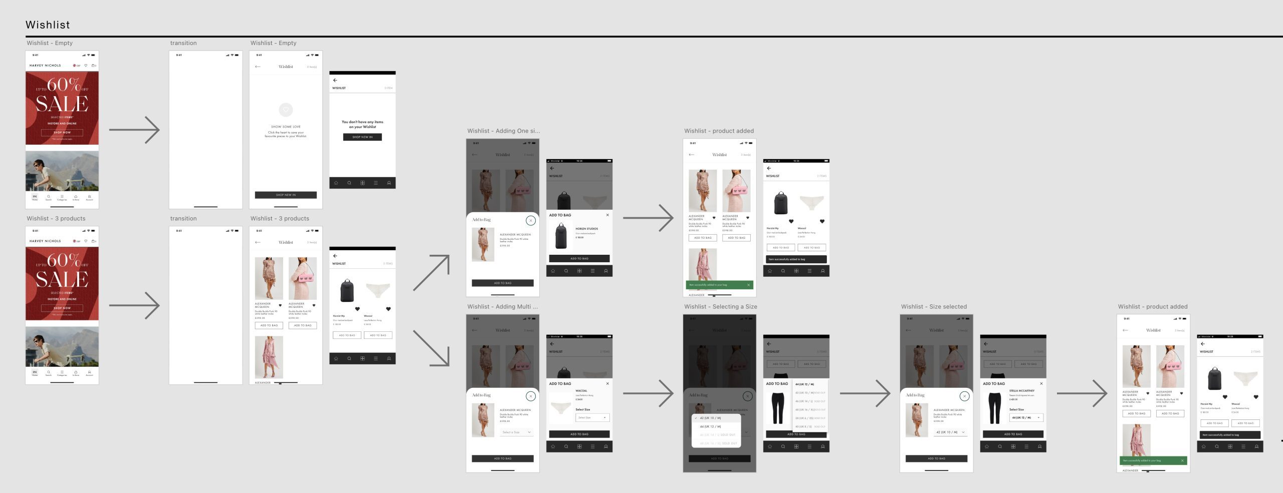
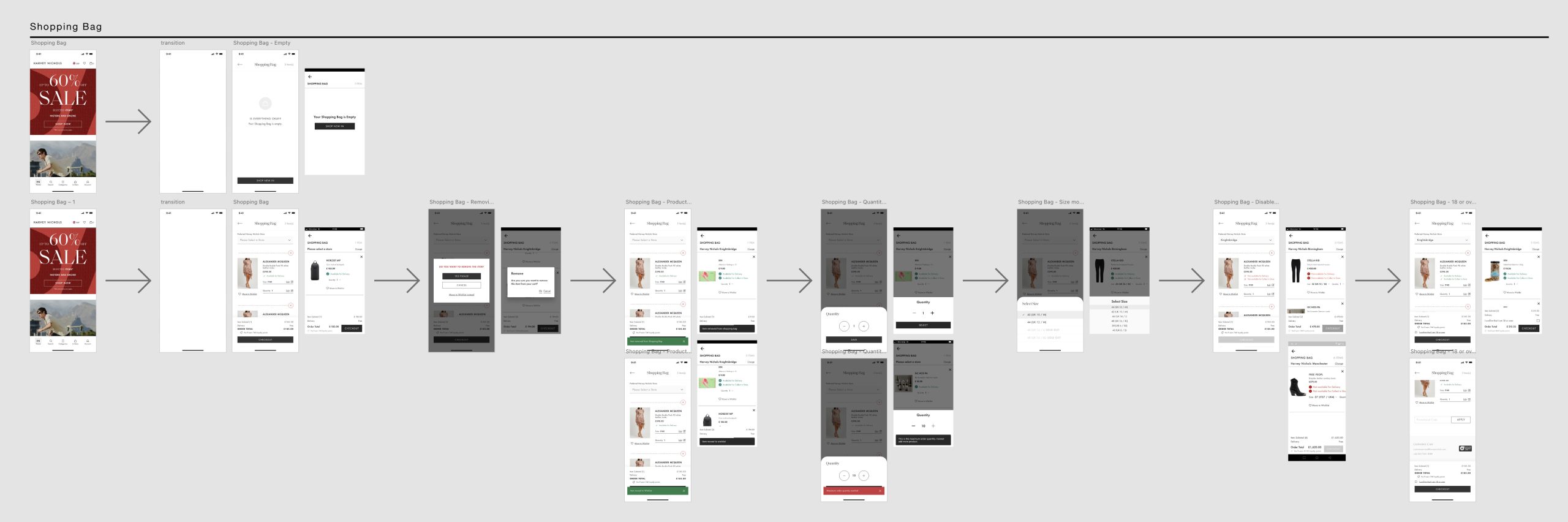
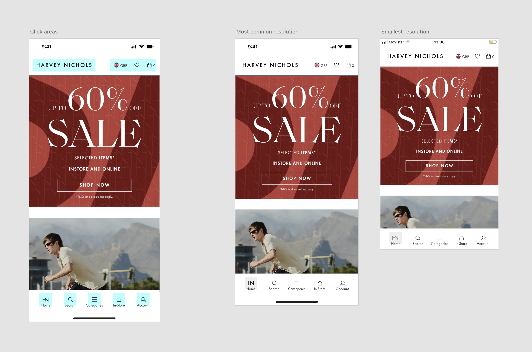
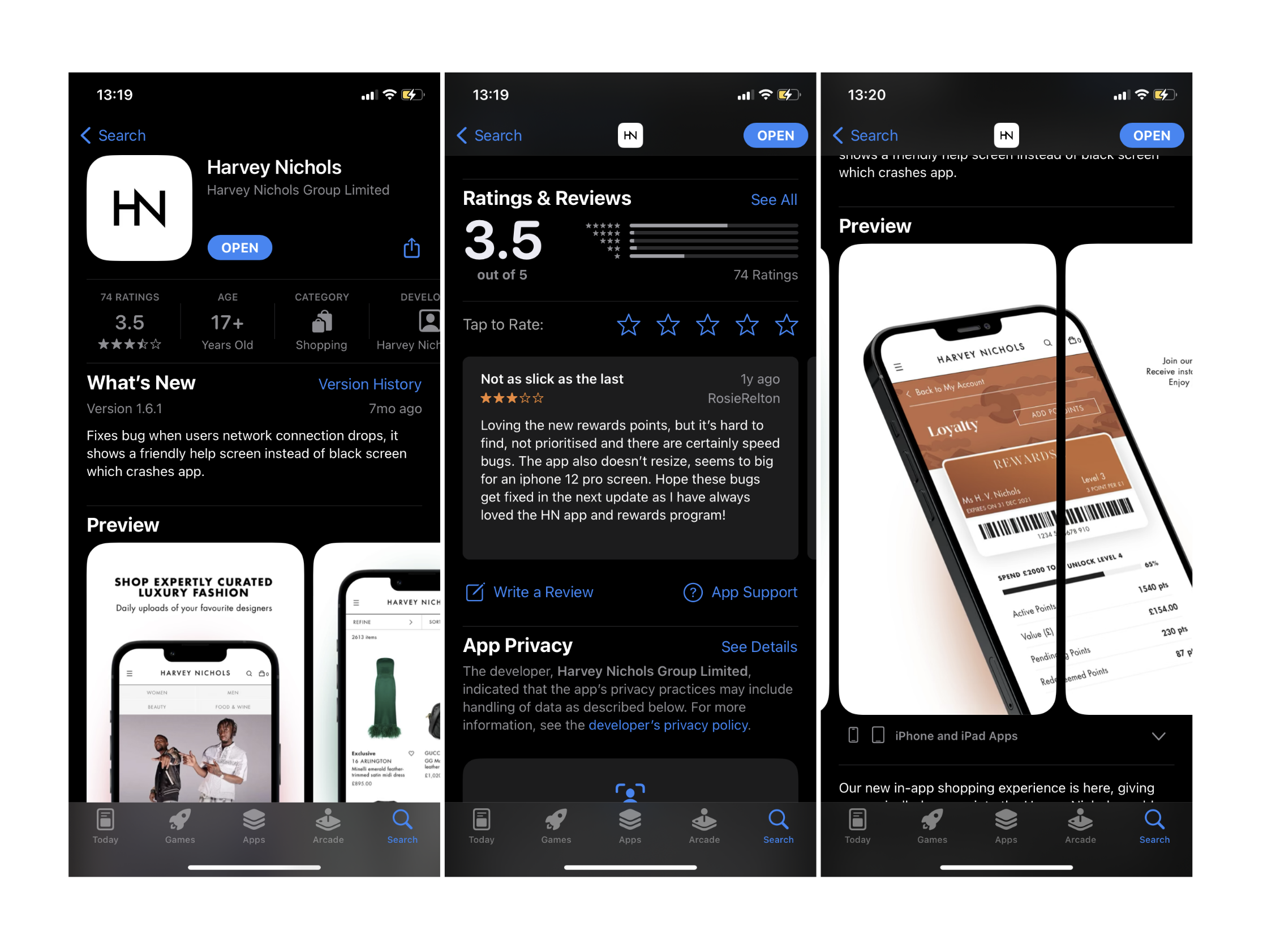
This project involves a significant update to our native app, The comprehensive overhaul included UI enhancements and UX improvements, such as a store selector and Loyalty card integration, ensuring the app met modern user expectations. Due to the lack of comprehensive data, we can only estimate the potential users affected by these changes.

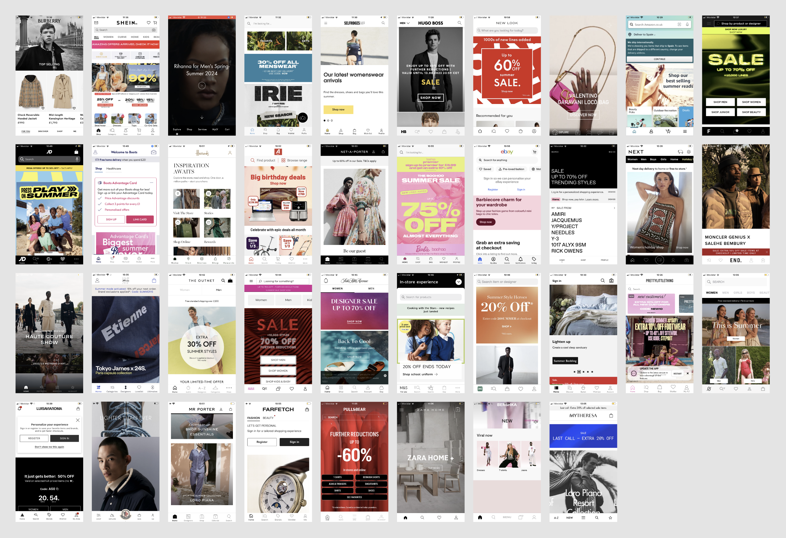
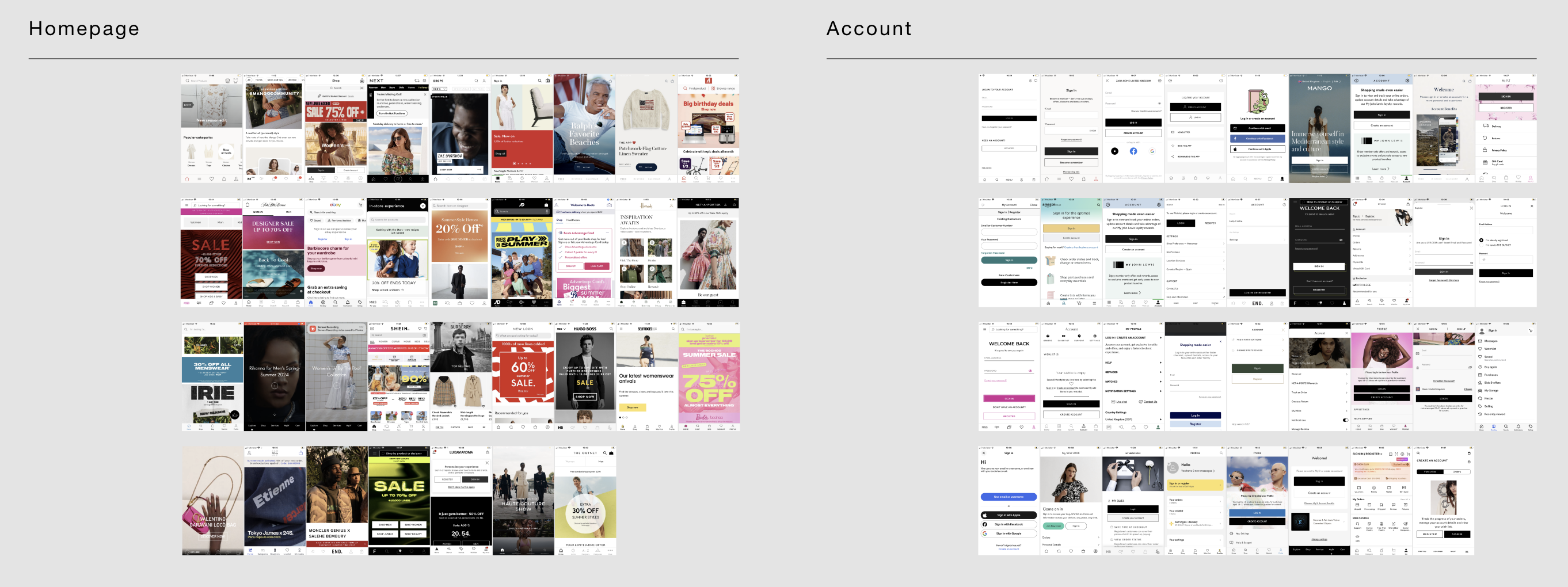
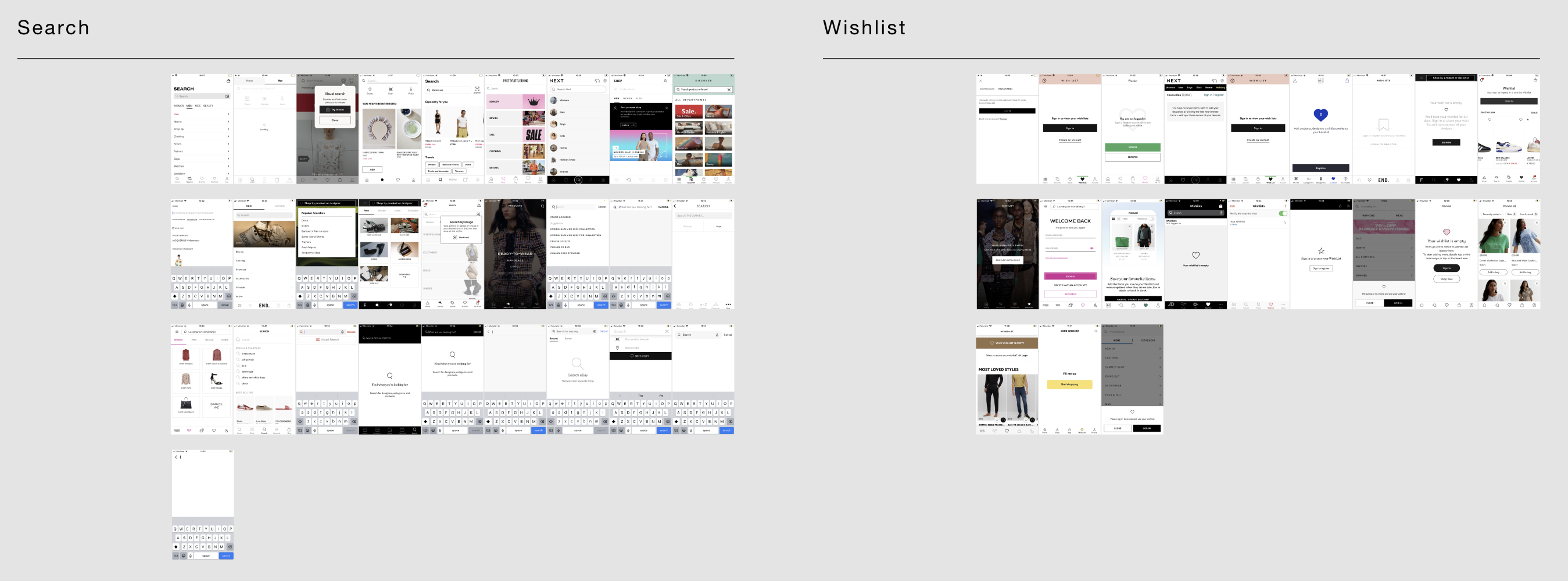
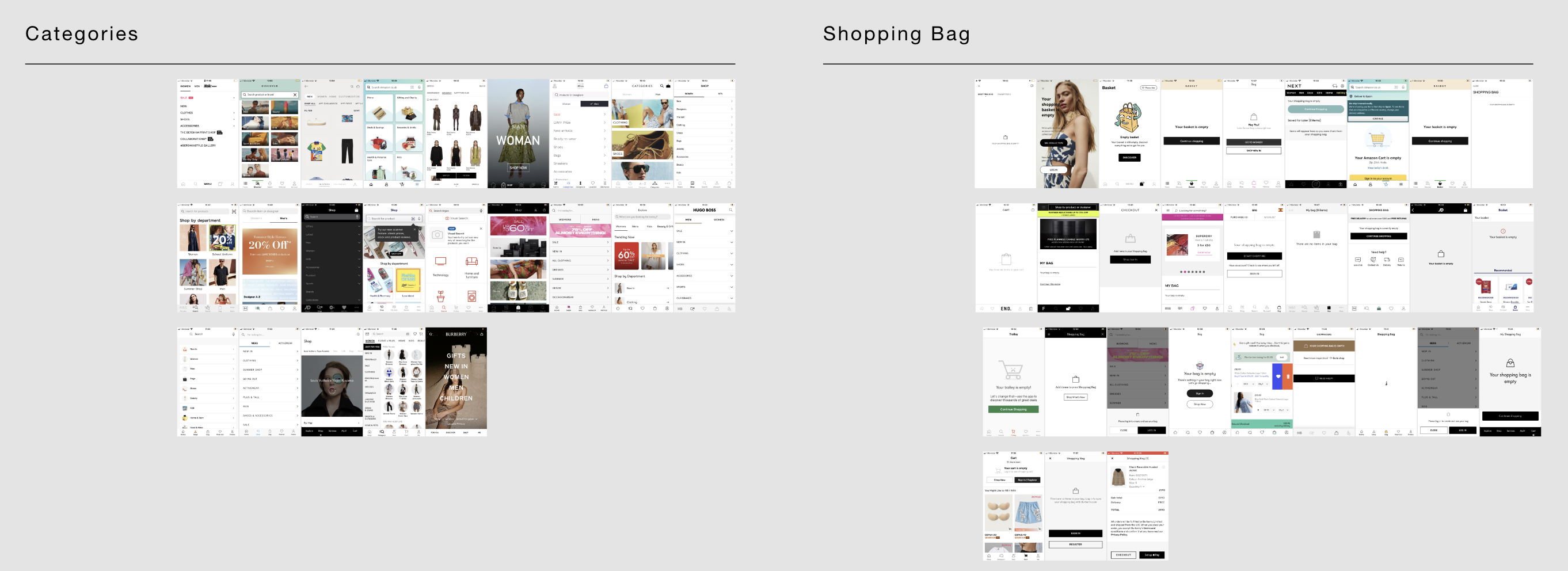
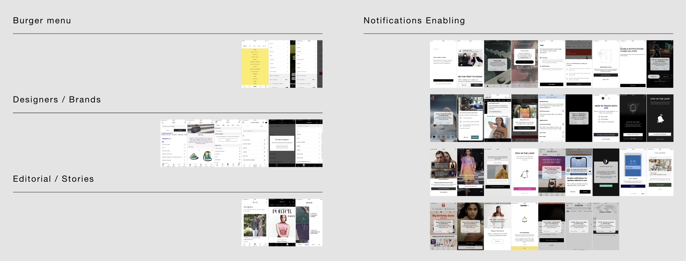
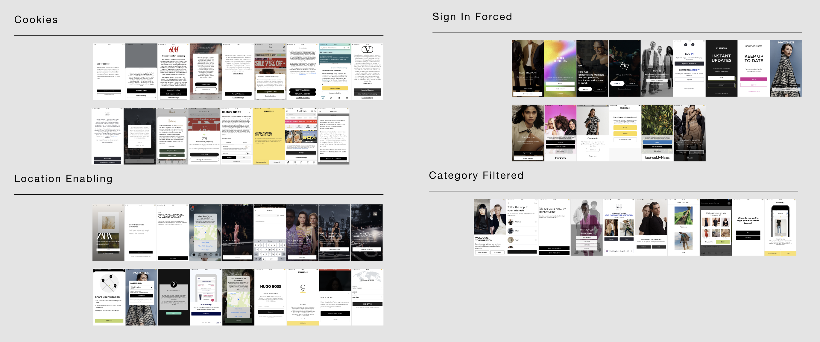
The update process will commence with initial planning aimed at gathering user data. Following this, an exhaustive competitor analysis will be conducted by examining 38 retailer native apps across various sections. Based on the insights gained, a detailed roadmap will be created to prioritise and implement the necessary updates.

Through these efforts, I ensured that the Harvey Nichols app was not just functional but also provided a seamless and engaging user experience that reflected our brand values.

Initial Planning

During the initial planning step, we will ensure that the number of users affected by this update/change is significant enough to impact our metrics. Our goal is to observe a notable increment in our conversion rates, indicating that the enhancements are effectively meeting user needs and driving engagement.

Additionally, we will implement mechanisms to accurately track and report these changes. This data-driven approach will allow us to fine-tune our strategies and continuously improve the app's performance and user satisfaction.

Competitor Analysis

A competitor analysis involving the download of 38 retailer native apps entails a comprehensive examination of these apps to understand their features, user experience, and overall performance. This analysis is divided into different sections, each focusing on specific aspects such as:

User Interface (UI) and User Experience (UX): Evaluating the design, layout, and navigation.
Features and Functionalities: Identifying key functionalities like payment options, personalisation, and loyalty programs.
Performance: Assessing load times, responsiveness, and stability.
Customer Reviews and Ratings: Analysing user feedback and app store ratings.

This structured approach helps identify industry trends, best practices, and areas for improvement, ultimately informing strategic decisions for enhancing one's own app.

Roadmap definition

In this project, due to the numerous concurrent projects, the project manager was unable to provide a detailed roadmap. Recognising the need for clear guidance, I took the initiative to create and refine the roadmap myself.

This included identifying and prioritising key tasks and milestones, ensuring that the project stayed on track and aligned with its objectives. By doing so, I clarified the priorities and provided the team with a structured plan, crucial for managing the project's complexity and scale. This proactive approach ensured efficient progress and timely delivery of the update.

UX updates

Being a plain template, the first version of the app had numerous useless features and others that were not very accurate.

In the screenshot below, you'll see the original in-store feature, and underneath it, the updated version. Beyond just UI changes, the experience has been completely revamped. The new design includes a store selector and integrates the Loyalty card feature, essential for in-store transactions as personnel require the loyalty card for each purchase.

This update significantly improves usability and aligns with the needs of our customers and staff.

UI updates

- Code Implementation: Developers start coding the changes based on the updated designs and functional requirements.
- Integration: Ensure seamless integration of new features with existing functionalities.
- Backend Updates: If necessary, update backend services and APIs to support new functionalities.

Development

Click Areas: During development, ensuring that click areas are appropriately sized and placed was crucial. We aimed for touch targets that are easy to interact with, reducing the chance of user errors and enhancing the overall experience.

Smallest Device Tested: The smallest device we tested was an iPhone SE. This ensured that the app's interface and functionality were accessible and usable even on devices with limited screen real estate, preventing user frustration among this segment.

Most Common Device Tested: The most common device tested was the iPhone 11. By focusing on this widely used model, we ensured that the app performs optimally for the majority of our user base, providing a smooth and efficient experience.

These considerations were integral to refining the app’s UI and UX, leading to a robust and user-friendly product.      

Market submissions

When preparing for an app update submission to the iOS and Android app stores, it's crucial to have the right assets to effectively communicate the changes and improvements.

For our latest update, the following assets were developed:

Updated Screenshots: High-resolution images showcasing the new UI and UX enhancements, including the store selector and integrated Loyalty card feature. These screenshots highlight the revamped in-store experience.
App Previews: Short video clips demonstrating the updated functionalities, providing potential users with a dynamic view of the improvements.
App Icon: If necessary, a refreshed app icon to align with the new design aesthetics.
Feature Graphics and Banners: Promotional images used in the app stores to attract user attention and emphasise key updates.
Description and Release Notes: Detailed descriptions and release notes outlining the significant changes, focusing on the new features and the improved user experience.These assets are designed to ensure that the update is clearly communicated to users, helping to drive downloads and positive engagement with the app's new features.

Conclusion

The launch of Harvey Nichols' first transactional app marked a significant milestone in the company's digital transformation. By leading this project, I ensured that the app not only met but exceeded user expectations through a blend of strategic UI enhancements and innovative UX improvements. From incorporating a store selector and Loyalty card integration to conducting comprehensive competitor analyses and user testing, the project emphasised a commitment to excellence and customer satisfaction. This app now serves as a vital tool for engaging with our customers, enhancing their shopping experience, and driving the brand's digital growth.